The Search Form Builder widget in WPRentals lets you create a custom search form inside an Elementor page.
Use this widget when you want a specific page, such as the homepage or a landing page, to have its own search form layout, fields, and button design.
What the Search Form Builder Does
The Search Form Builder gives you control over the search form used on an Elementor page.
With this widget, you can manage:
- which search fields are included
- the order of the fields
- the field labels
- the search button text
- the search button icon
- the button width
- the spacing, colors, typography, and layout
You can use it to create a custom search experience for a specific page without changing the global search form used across the rest of the website.
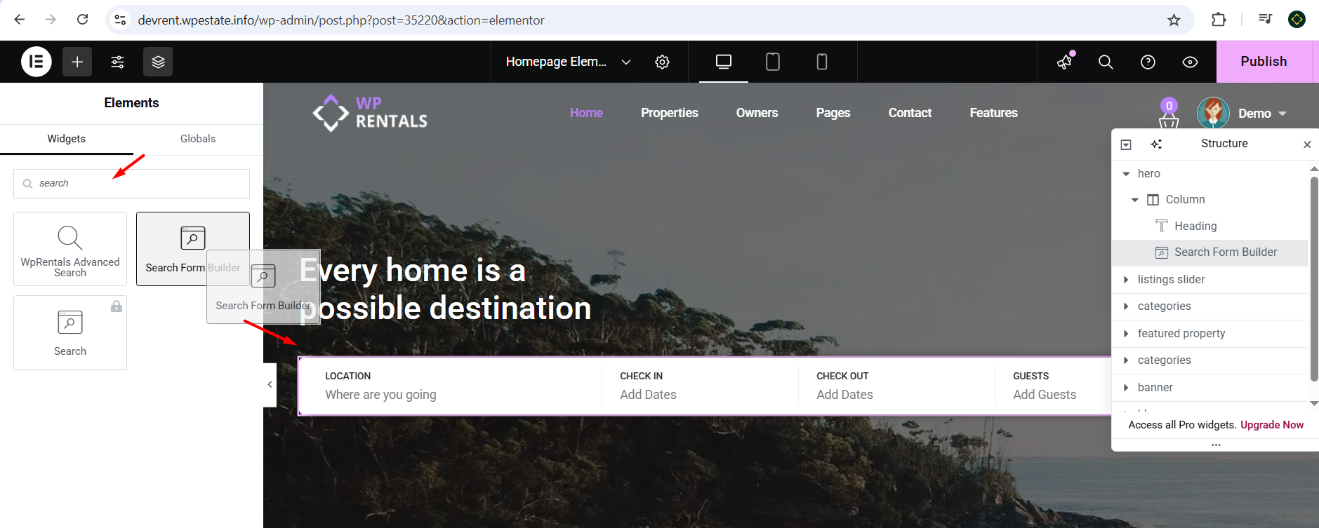
Add the Widget in Elementor
To add the Search Form Builder widget:
- Go to the page where you want to add the search form.
- Click Edit with Elementor.
- In the Elementor sidebar, search for Search Form Builder.
- Drag the widget into the section where you want the search form to appear.
Configure Search Fields
After adding the widget, configure the fields that should appear in the search form.
You can:
- add search fields
- remove fields you do not need
- rearrange the field order
- set labels for the fields
- choose the correct compare rule for each field
Available search fields can include location fields, listing categories, check-in and check-out dates, guests, price, taxonomy fields, and WPRentals listing custom fields.

Use Listing Custom Fields in the Search Form Builder
All listing custom fields created in WPRentals can be added to the Elementor Search Form Builder.
Listing custom fields are created from:
WPRentals Options → General → Listing Custom Fields
After the custom field is created, edit the Elementor page, open the Search Form Builder widget, and add the custom field to the search form.
The custom field must use the correct compare rule based on the field type.
Search Fields and Compare Rules
When adding fields to the Elementor Search Form Builder, use the correct compare rule. The compare rule controls how the field filters listings.
| Search Field | Field Type | MUST HAVE Compare Rule | Notes |
|---|---|---|---|
| Location | Location / text search | Like | Used for Google Places, OpenStreet Places, or theme location search. |
| Check-in | Date | Date Greater | Used for the arrival date. |
| Check-out | Date | Date Smaller | Used for the departure date. |
| Guests | Number / dropdown | Greater | Shows listings that allow the selected number of guests or more. |
| Price | Number / price field | Greater | Use Greater for the price field in the Elementor Search Form Builder. |
| Listing City | Taxonomy / dropdown | Like | Used when City is added as a separate dropdown field. |
| Property Area | Taxonomy / dropdown | Like | Used when Area is added as a separate dropdown field. |
| Listing Main Category | Taxonomy / dropdown | Like | Used for the main listing category. |
| Second Category | Taxonomy / dropdown | Like | Used for the second listing category or listing type. |
| Property Category | Taxonomy / dropdown | Like | Used for listing category taxonomy search. |
| Property Type | Taxonomy / dropdown | Like | Used for listing type taxonomy search. |
| Listing County | Text input | Like | Used for county text search. |
| Listing State | Text input | Like | Used for state text search. |
| Listing Country | Dropdown | Like | Uses the theme country list. |
| Bedrooms | Number / dropdown | Greater, Equal, or Smaller | Use Greater when visitors should find listings with at least the selected number. |
| Bathrooms | Number / dropdown | Greater, Equal, or Smaller | Use Greater when visitors should find listings with at least the selected number. |
| Rooms | Number / dropdown | Greater, Equal, or Smaller | Use based on the search behavior you need. |
| Beds and Baths Component | Combined component | Equal | The results show listings with the selected number of beds or baths, or more. |
| Features and Amenities | Feature list / checkbox style | Feature field settings | Enable and select the features you want to show in search. |
| Listing Custom Field – Text | Custom text field | Like | Use for text-based custom fields. |
| Listing Custom Field – Dropdown | Custom dropdown field | Like | Use for dropdown custom fields. |
| Listing Custom Field – Number | Custom numeric field | Greater, Equal, or Smaller | Use based on whether the search should match higher, equal, or lower values. |
| Listing Custom Field – Date | Custom date field | Date Greater or Date Smaller | Use Date Greater for start/min dates and Date Smaller for end/max dates. |
| Zip | Text input | Like | Used for zip or postal code search. |
| Size | Number input | Greater, Equal, or Smaller | Use based on the search behavior you want. |
Search Button Text, Icon, and Width
The Search Form Builder widget lets you manage the search button directly from Elementor.
To edit the search button:
- Edit the page with Elementor.
- Select the Search Form Builder widget.
- Open the Content tab.
- Open the Submit Button section.
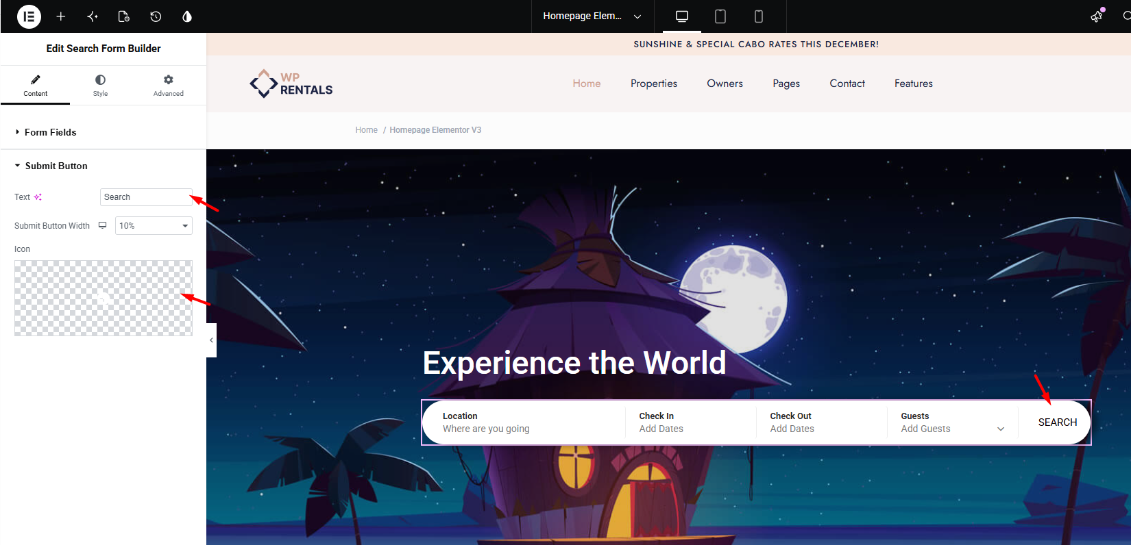
From this section, you can manage:
- Text – add the button text, for example Search or Search hotel.
- Submit Button Width – set how much space the button uses inside the form.
- Icon – add, change, or remove the button icon.
Change the button style from STYLE settings
Style the Form
From the widget style settings, you can customize the general form layout.
You can manage:
- columns and row spacing
- form gap
- label color and typography
- padding
- border radius
- form colors

Style the Fields
You can also style the individual search fields.
Field styling options can include:
- font family
- font size
- font weight
- text color
- background color
- border color
- padding and margin

Style the Search Button
The search button has separate style controls in the Style tab.
To style the button:
- Edit the page with Elementor.
- Select the Search Form Builder widget.
- Open the Style tab.
- Open the Button section.
From the Button section, you can manage:
- Submit Button Background Color – controls the button background.
- Submit Button Text Color – controls the button text color.
- Icon Color – controls the icon color if an icon is used.
- Typography – controls the font family, size, weight, and style.
- Border Type – controls the button border.
- Submit Button Border Radius – controls the roundness of the button corners.
- Submit Button Text Padding – controls the spacing inside the button.
- Icon Size – controls the icon size if an icon is used.
- Icon Size Padding – controls the spacing around the icon.
You can style both the Normal State and the Hover State of the button.
If you remove the icon and use text only, you can leave the icon controls empty. If there is still extra spacing where the icon was, set Icon Size and Icon Size Padding to 0.
Global Search Form Note
The Elementor Search Form Builder is only one search form option in WPRentals.
WPRentals also includes global search forms managed from Theme Options. These are used by the theme in areas such as hero media search, mobile search, search shortcode, search widget, and other default search layouts.
To manage the global search form, go to:
WPRentals Options → Search → Advanced Search Form
Related Help
Advanced Search Type 1 and 2 custom search fields