This article explains how to manage the default WPRentals header options from Theme Options > Header.
The header controls the top area of the website, including the logo, menu, user menu, mobile menu, top bar widget area, hero media, and header colors.
Header Settings
Go to:
Theme Options > Header > Header Settings
This section controls the default header layout, header height, sticky header height, menu font size, and other general header options.
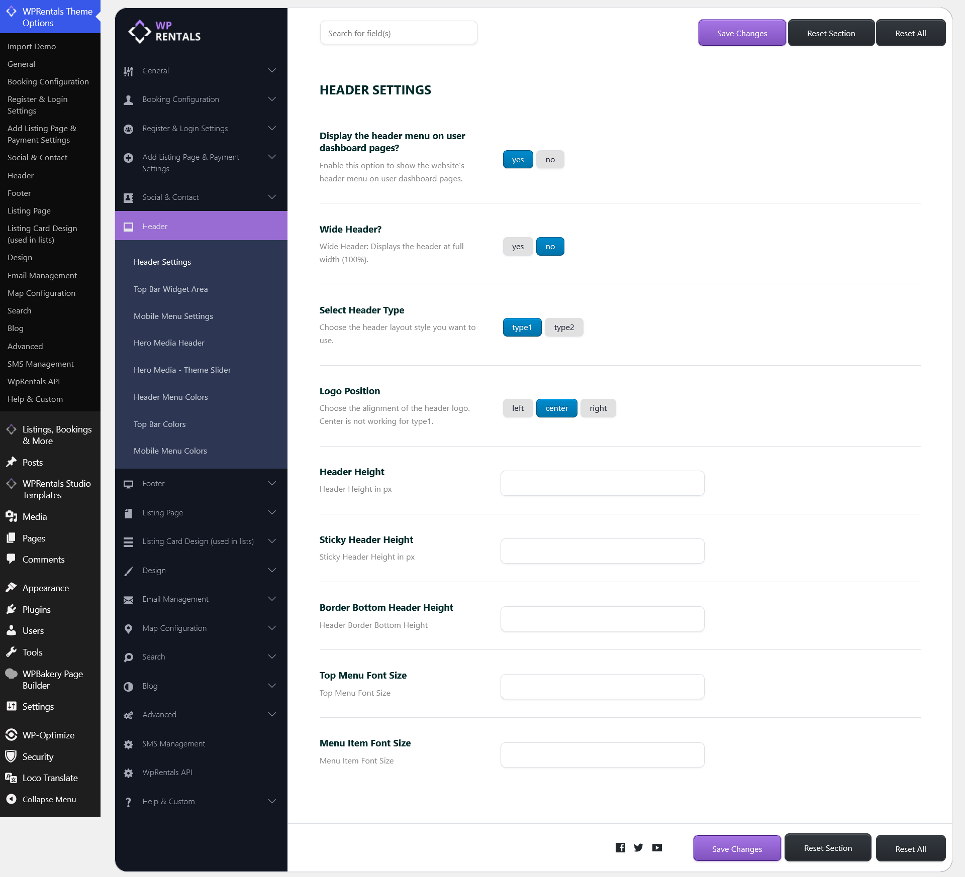
Display the header menu on user dashboard pages?
- Yes – the website header menu appears on user dashboard pages.
- No – the header menu is hidden on user dashboard pages.

Wide Header?
- Yes – the header stretches to the full browser width.
- No – the header stays aligned with the website content container.
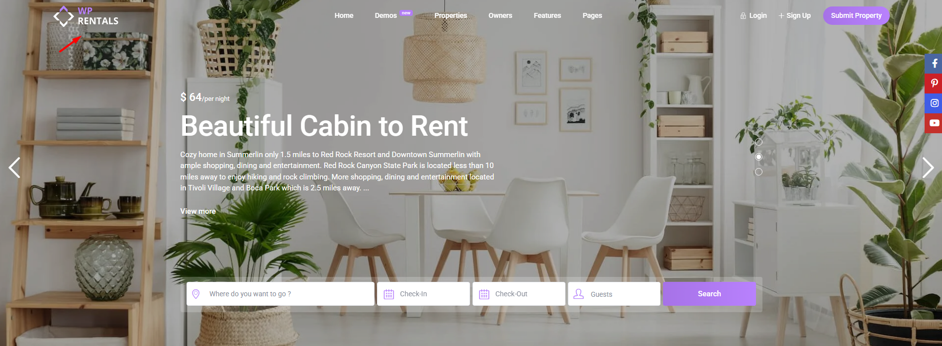
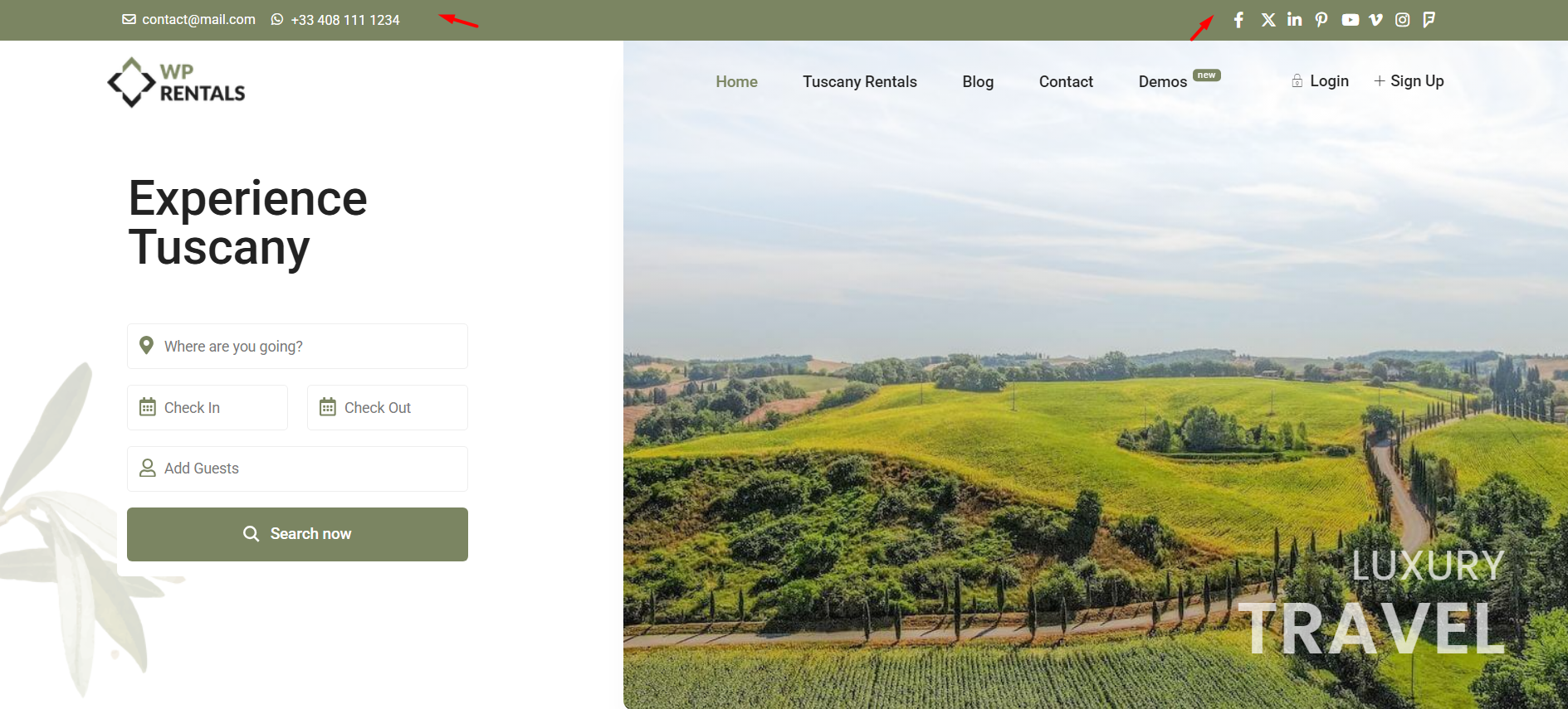
Select Header Type
This option controls the default header layout.
- Type 1 – menu, logo, and user menu are displayed in one row.
- Type 2 – logo is displayed in one row, and the menu/user menu are displayed in a second row.
Type 1 example:

Type 2 example:

Header Alignment / Logo Position
This option controls the logo position inside the header.
- Left
- Center
- Right
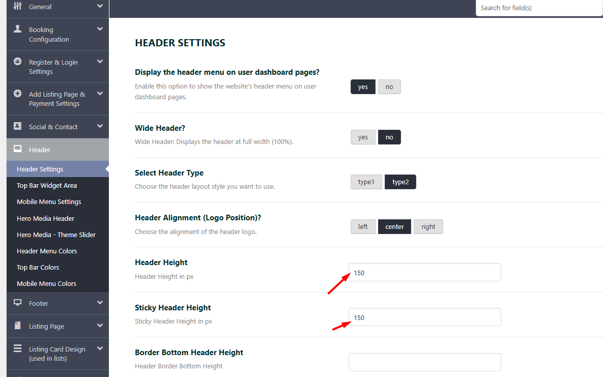
Header Height
This option controls the default header height.
Sticky Header Height
This option controls the height of the header when the sticky header is active while scrolling.
Border Bottom Header Height
This option controls the thickness of the bottom border of the header.
Top Menu Font Size
This option controls the font size for the top menu items.
Menu Item Font Size
This option controls the font size for the main menu items.
Top Bar Widget Area
Go to:
Theme Options > Header > Top Bar Widget Area
The top bar is the widget area displayed above the main header.
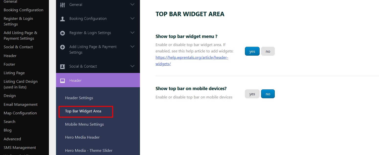
Show top bar widget menu?
- Yes – the top bar widget area is displayed.
- No – the top bar widget area is hidden.
Related help:
Header Widgets
Show top bar on mobile devices?
- Yes – the top bar is also displayed on mobile devices.
- No – the top bar is hidden on mobile devices.
Mobile Menu Settings
Go to:
Theme Options > Header > Mobile Menu Settings
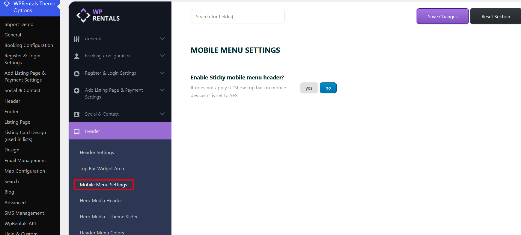
Enable Sticky mobile menu header?
- Yes – the mobile menu header stays fixed at the top of the screen while scrolling.
- No – the mobile menu header scrolls with the page.
Sticky Menu and Non-Sticky Header
The mobile sticky header can be disabled directly from:
Theme Options > Header > Mobile Menu Settings > Enable Sticky mobile menu header?
Set this option to No if you do not want the mobile menu header to stay fixed while scrolling.
For desktop, there is no simple on/off option for the default theme header sticky behavior.
If you need full control over the desktop header, you can use a custom Elementor header through WPRentals Studio instead of the default theme header.
Related help:
WPRentals Studio and Elementor Free
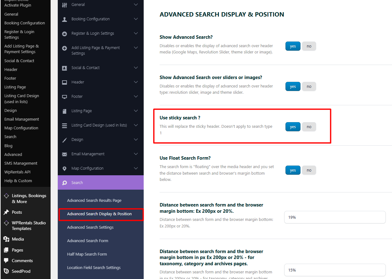
As a workaround, you can also enable the Sticky Search option. Even if you do not use Sticky Search on the homepage, enabling it can disable the sticky header behavior.
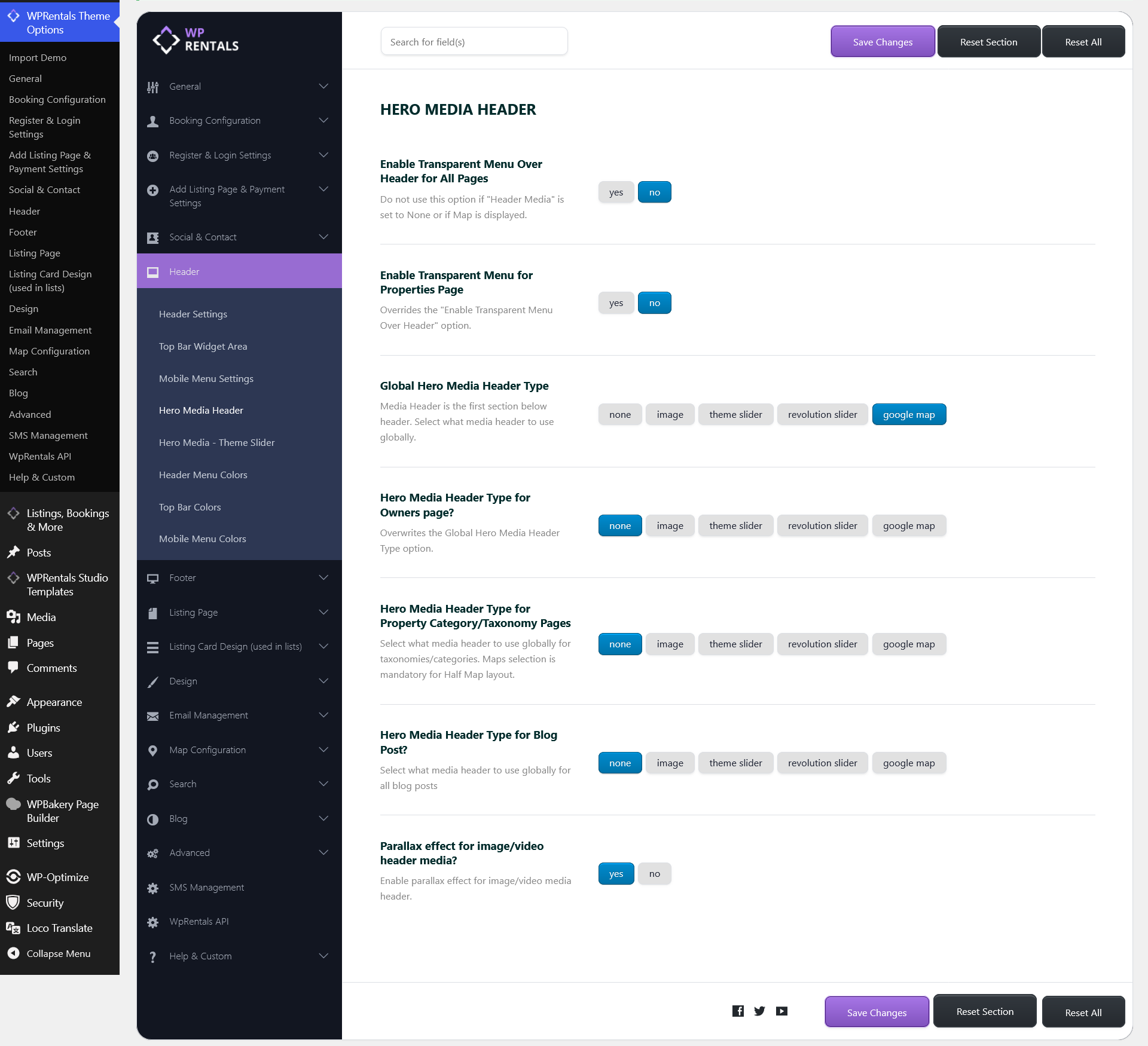
Hero Media Header
Go to:
Theme Options > Header > Hero Media Header
The Hero Media Header controls the global visual header area used on pages and posts, such as an image, video, slider, map, or no hero media.
This is independent from the default header/menu area. The header/menu controls the logo and navigation. Hero Media controls the visual section below or behind the header, depending on your settings.
Related help:
Global Header Options
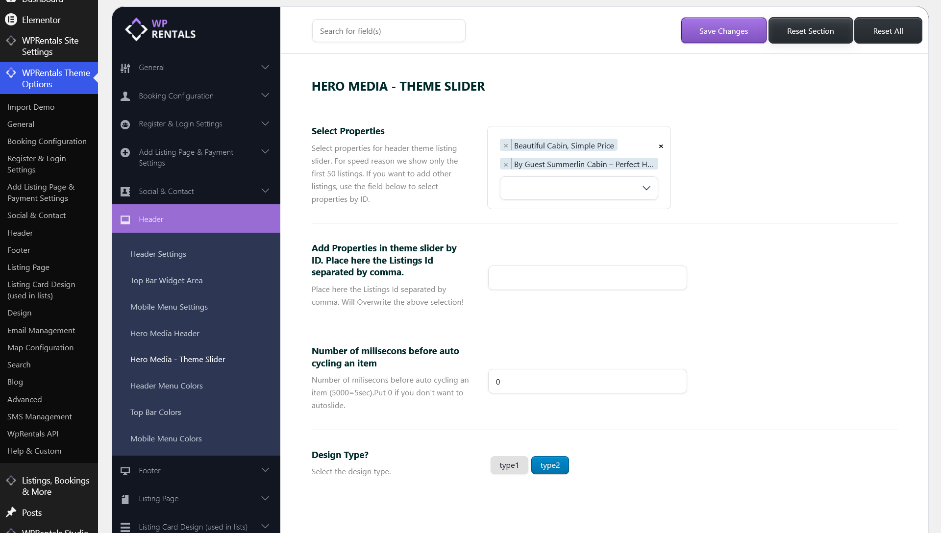
Hero Media – Theme Slider
The Theme Slider allows you to create a homepage header slider with listing images, links, and listing data.
This option is part of the Hero Media Header system.
Related help:
Theme Slider
Header Menu Colors
Go to:
Theme Options > Header > Header Menu Colors
This section controls the colors used by the default WPRentals header menu.
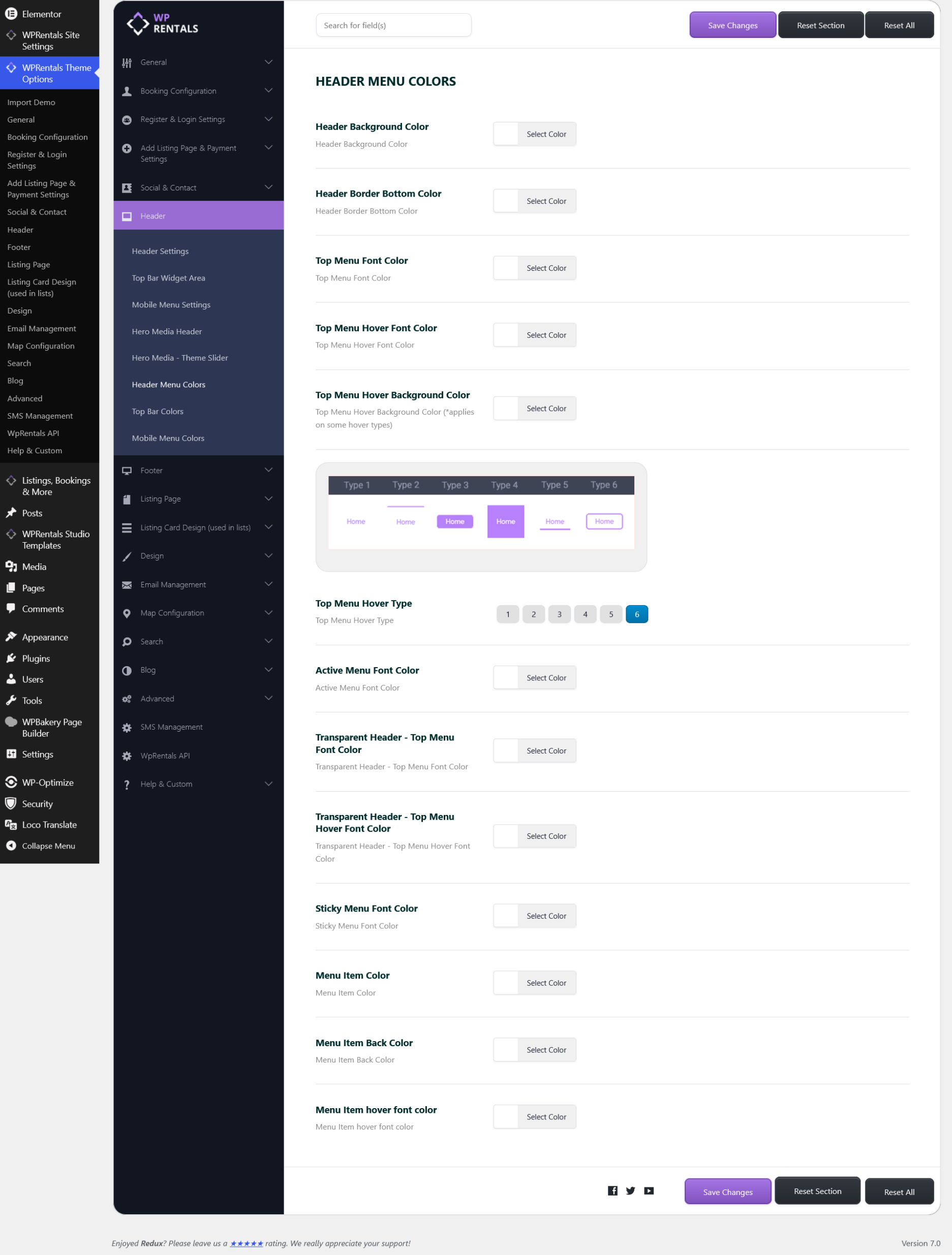
- Header Background Color – changes the header background color.
- Header Border Bottom Color – changes the color of the header bottom border.
- Top Menu Font Color – changes the top menu text color.
- Top Menu Hover Font Color – changes the top menu text color on hover.
- Top Menu Hover Background Color – changes the background color on hover.
- Top Menu Hover Type – controls the hover effect type.
- Active Menu Font Color – changes the color of the active/current menu item.
- Transparent Header – Top Menu Font Color – changes menu text color when the default transparent header is used.
- Transparent Header – Top Menu Hover Font Color – changes hover color when the default transparent header is used.
- Sticky Menu Font Color – changes menu text color when the default sticky header is active.
- Menu Item Color – changes menu item text color.
- Menu Item Background Color – changes menu item background color.
- Menu Item Hover Font Color – changes menu item text color on hover.
Top Bar Colors
Go to:
Theme Options > Header > Top Bar Colors
These options control the colors used by the Top Bar Widget Area.
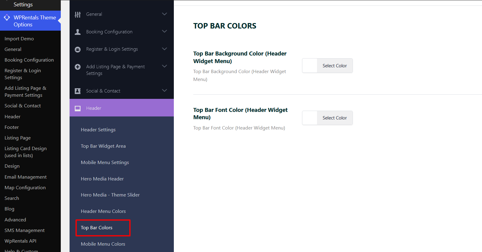
- Top Bar Background Color – changes the background color of the top bar.
- Top Bar Font Color – changes the font color of the top bar content.
Mobile Menu Colors
Go to:
Theme Options > Header > Mobile Menu Colors
These options control the colors used by the mobile header and mobile menu.
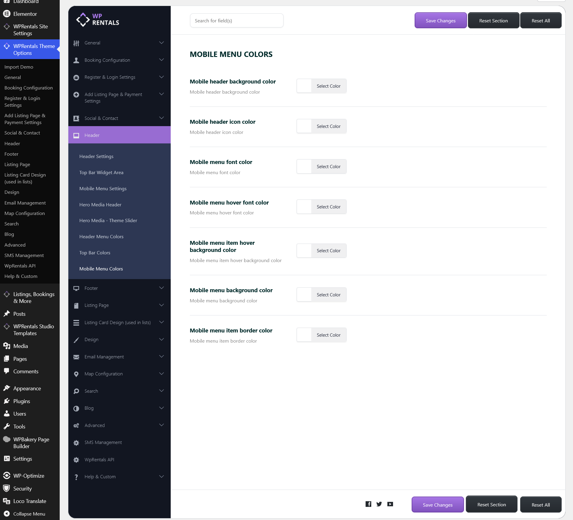
- Mobile Header Background Color – changes the mobile header background color.
- Mobile Header Icon Color – changes the icon color in the mobile header.
- Mobile Menu Font Color – changes the mobile menu item text color.
- Mobile Menu Hover Font Color – changes the mobile menu text color on hover.
- Mobile Menu Item Hover Background Color – changes the mobile menu item background color on hover.
- Mobile Menu Background Color – changes the mobile menu background color.
- Mobile Menu Item Border Color – changes the mobile menu item border color.
Custom Header with WPRentals Studio
If you want full visual control over your header, you can build a custom header template using WPRentals Studio and Elementor.
A custom Studio header can include custom layouts, buttons, icons, menus, login elements, submit buttons, announcements, and different header designs for different parts of the website.
Before you start
- Make sure Elementor is installed and activated.
- Make sure WPRentals Studio is installed and activated.
Step 1: Create a custom header template
- Go to WPRentals Studio in your WordPress admin.
- Create a new template.
- Select Header as the template type.
- Publish the template.
- Click Edit with Elementor.
- Build your header layout using Studio header widgets and Elementor sections or containers.
You can add:
- Logo
- Menu
- Login / Register elements
- Submit Property button
- Contact buttons or icons
- Announcement bar
- Secondary header row
Step 2: Control where the custom header appears
Edit the Studio header template and choose where the custom header should apply.
For example, you can assign it globally, only on the homepage, on specific pages, or on specific page types, depending on the available display rules.
If you create multiple header templates, keep one as the default/global header and use the others only for special sections of the website.
Helpful notes
- Mobile layout: Always check the custom header on desktop, tablet, and mobile. You may need to create a simpler mobile layout.
- Sticky header: Custom Studio header templates do not have sticky support.
- Transparent header: For a custom Studio header, transparency is managed from Elementor by adjusting the section/container background, positioning, spacing, and margins.
- Colors: Header colors from Theme Options apply to the default header. A custom Studio header uses the colors set directly in Elementor.