What is the Mobile Menu?
The mobile menu in WP Rentals is specifically designed for responsive devices (screens 1024px wide or less). It is managed independently from the desktop menu and can be activated by clicking on the dedicated mobile menu icon.

How to Manage/Create the Mobile Menu
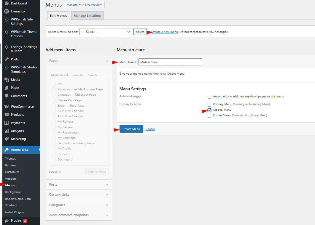
- Navigate to Admin → Appearance → Menus
Create a new menu or edit an existing one.
- Edit the Menu
Use WordPress’s drag-and-drop system to organize the menu items as you like.
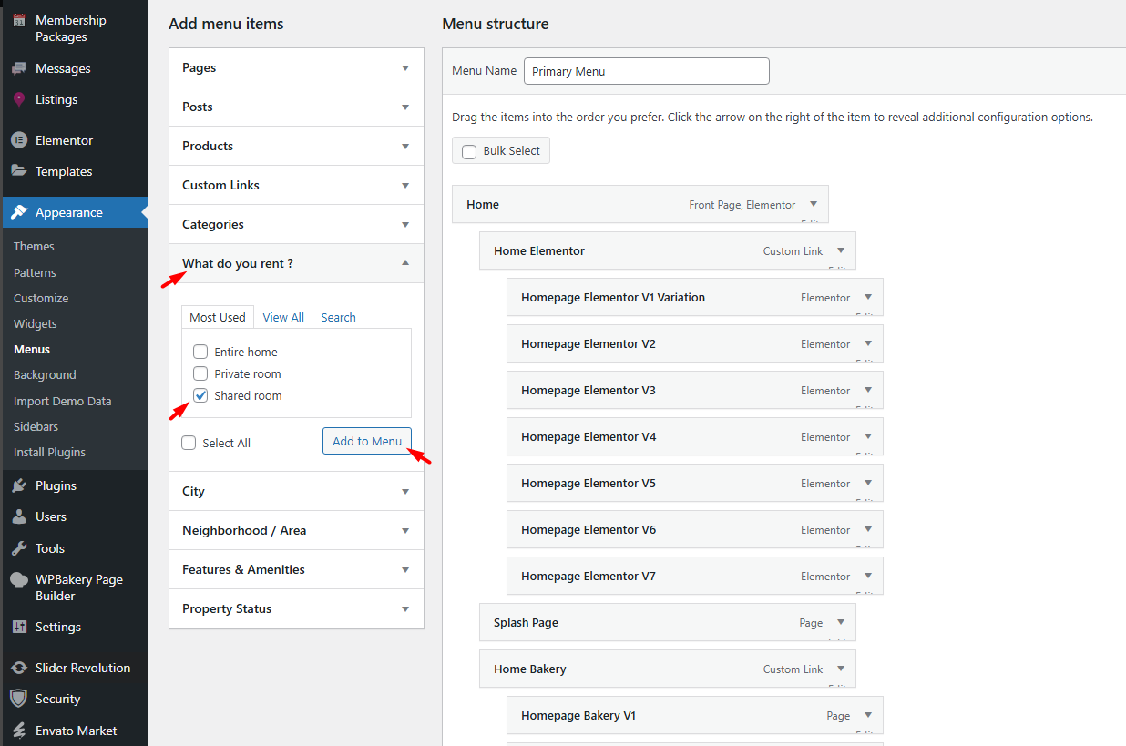
How to Add Categories, Areas, Actions, and Cities List Pages to the Menu
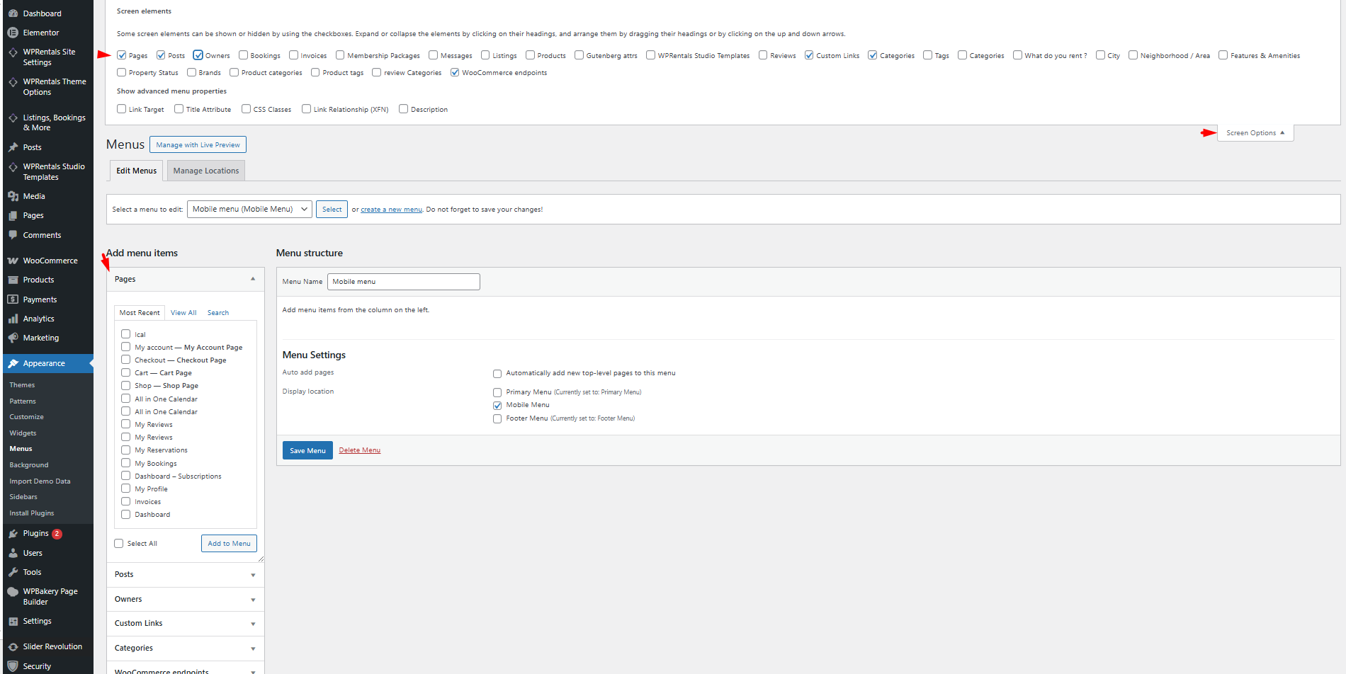
- Screen Options
Enable the categories you wish to see in the left-hand menu options. - Select Items
Choose the desired items (Categories, Areas, Actions, Cities) from the left lists. - Add to Menu
Click to add the selected items to the menu structure.
How to Make Sub-Menus Open on Responsive Devices
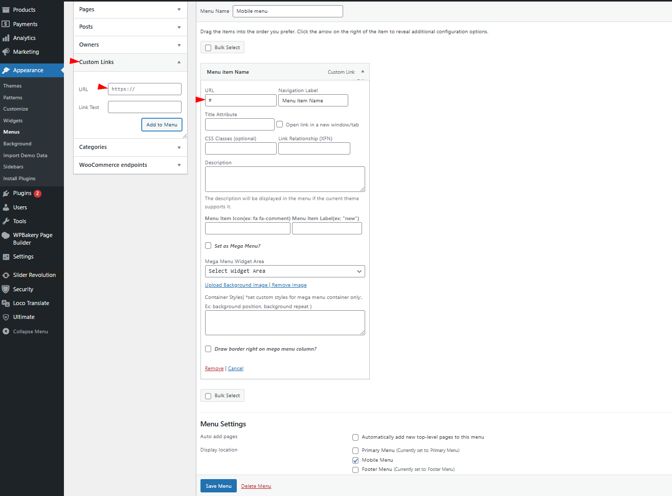
- Create Link Menus
For sub-menu items, create link menus with “#” as the link. - Add Sub-Menu Items
Under the parent menu item, add the sub-menu items as usual.
How to Assign a Menu as Mobile Menu
- Menu Settings
In the menu settings, assign the created or edited menu to be the mobile menu.

Mobile Menu Settings
This screenshot displays the Mobile Menu Settings in the WP Rentals theme.
Go to Header -> Mobile Menu Settings
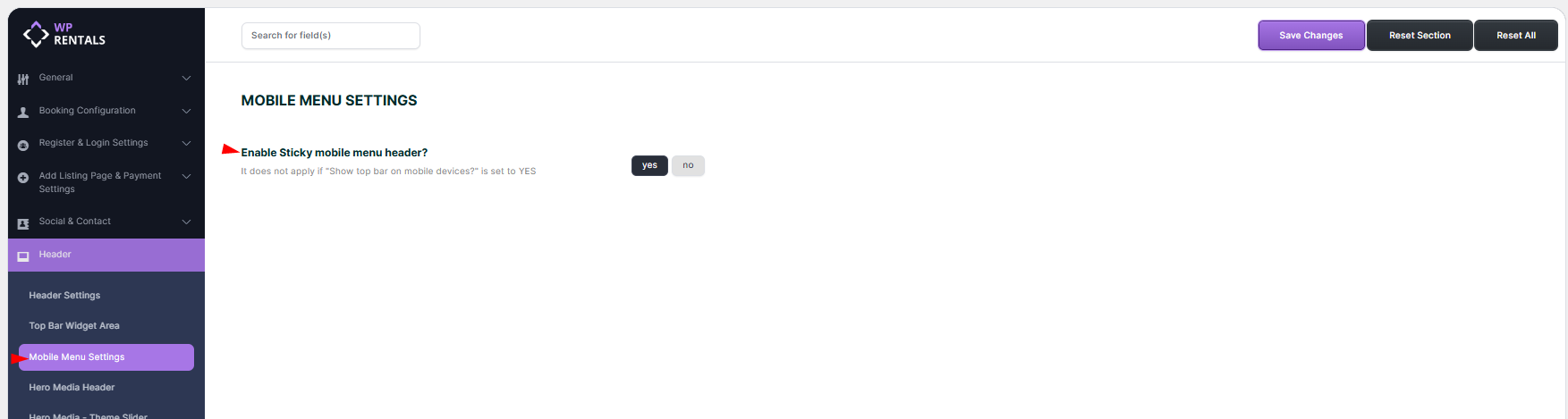
Enable Sticky mobile menu header?
- Yes / No Toggle
- If enabled (Yes), the mobile menu header will remain fixed (sticky) at the top of the screen when scrolling.
- If disabled (No), the mobile menu header will scroll along with the page.
- Important Note: This setting does not apply if “Show top bar on mobile devices?” is set to Yes (found in the Top Bar Widget Area settings).
Mobile Menu Colors
These settings let you change the mobile menu colors in Header -> Mobile Menu Colors
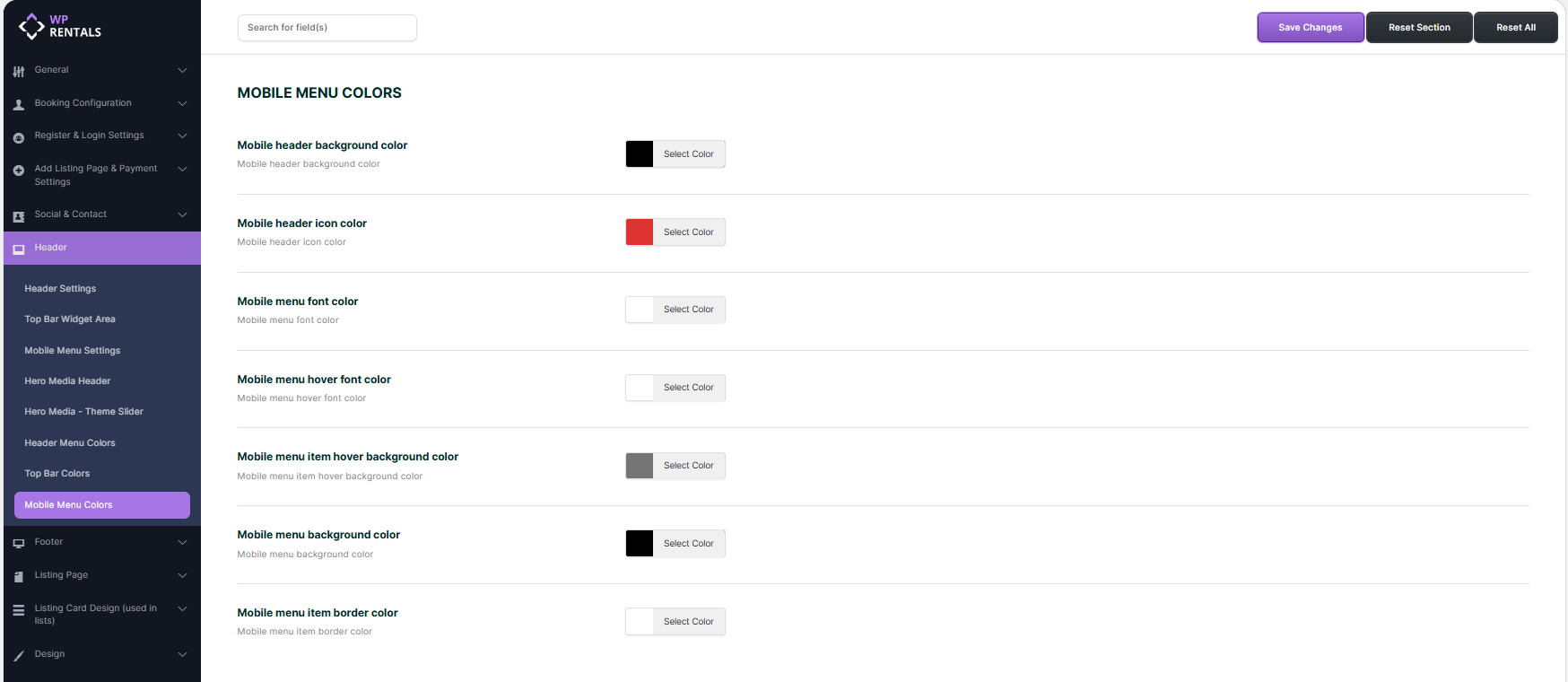
Mobile Header Background Color
Changes the background color of the mobile header.
Mobile Header Icon Color
Changes the color of the icons in the mobile header.
Mobile Menu Font Color
Changes the font color of the mobile menu items.
Mobile Menu Hover Font Color
Changes the font color when hovering over mobile menu items.
Mobile Menu Item Hover Background Color
Changes the background color when hovering over mobile menu items.
Mobile Menu Background Color
Changes the background color of the mobile menu.
Mobile Menu Item Border Color
Changes the border color of the mobile menu items.
How to Change the Icon for the User Menu on Mobile
To customize the user menu icon on mobile, add the following CSS in Theme Options → Custom CSS:
Add the below custom css in Theme Options -> Custom Css – https://help.wprentals.org/article/3029/
.fa-cogs:before {
    content: "\f041";
}
The icon code – f043 – you can take from fontawesome 4 – https://fontawesome.com/v4.7.0/icons/