The mobile menu can be managed independently from the Web view menu, and it shows only on responsive devices (1024px wide screens or lower).
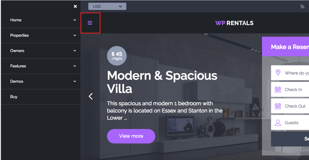
How does the mobile menu look
Mobile menu is triggered by clicking on the dedicated icon:
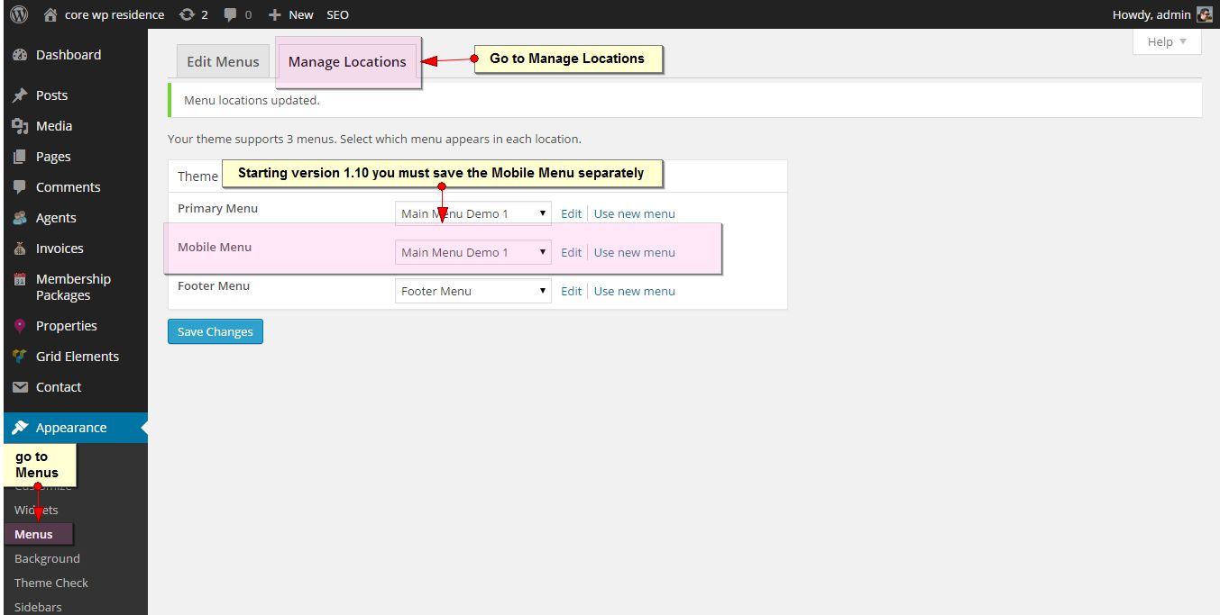
How to manage/create the mobile menu
- Go to Admin – Appearance Menus
- Create a menu or edit one you get with demo import (if you imported demo) –

How to Edit the Menu
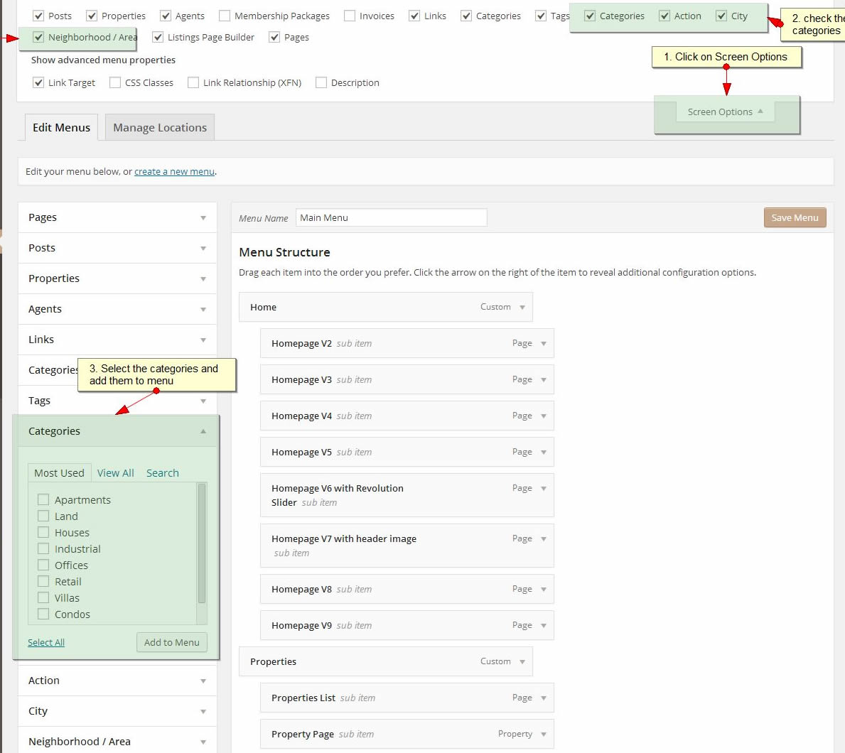
You can edit the menu using WordPress drag and drop system. Select the categories / links from the left lists, and use drag and drop to change the order of menu items.
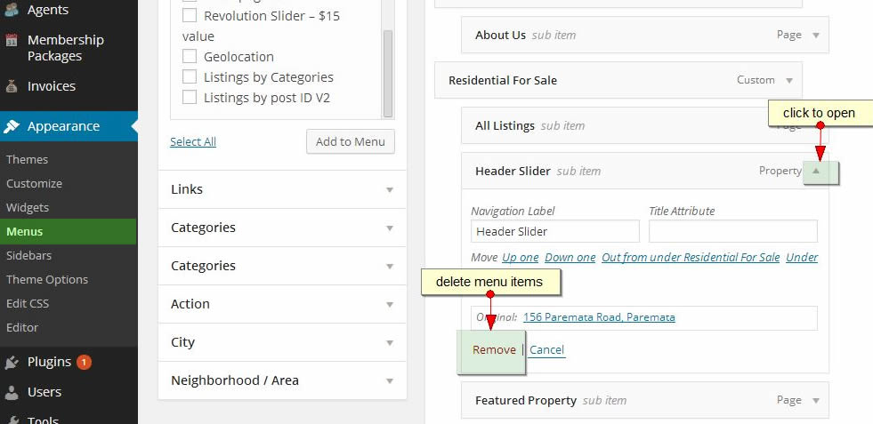
How to add Categories, Areas, Actions and Cities list pages to the menu
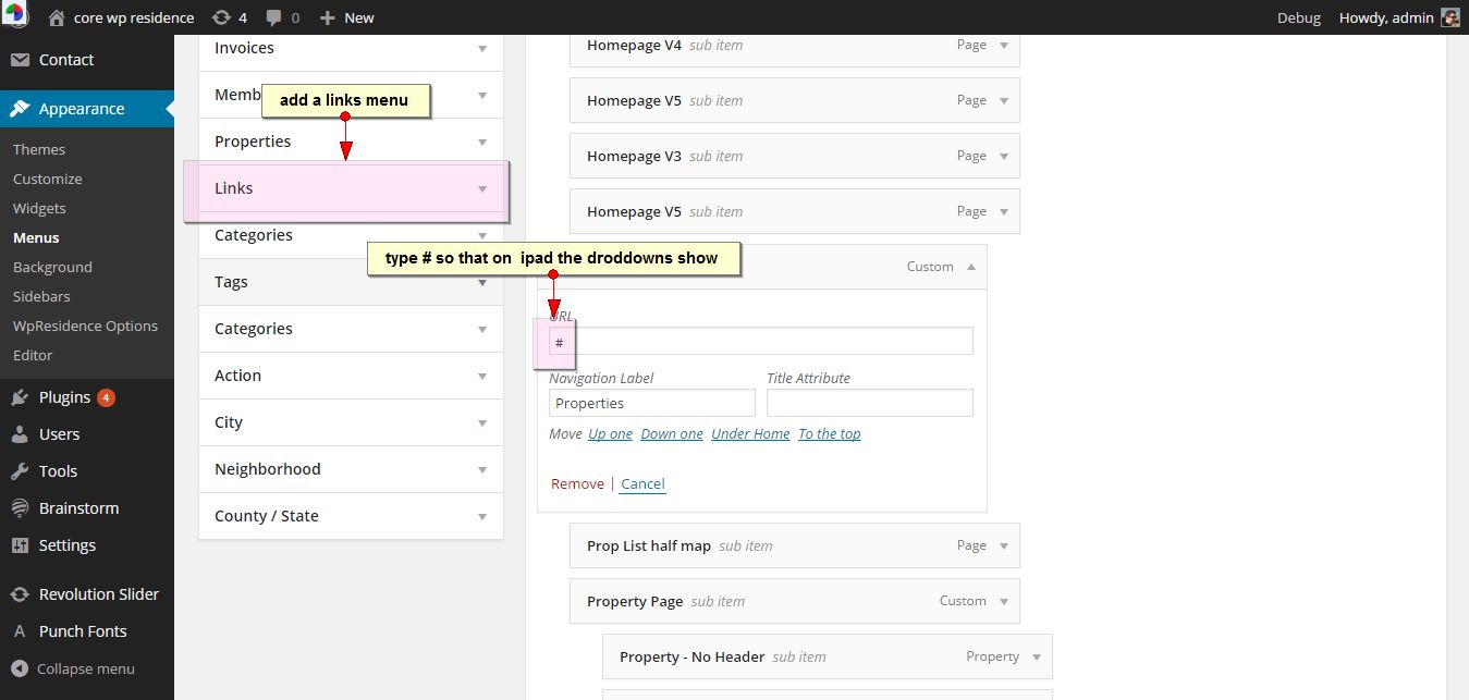
How to make sub-menus open on responsive devices
Create link menus and add # for the link. The add sub-menu items and save.
How to assign a menu as Mobile Menu
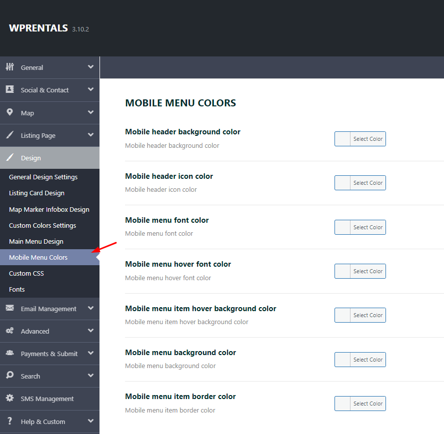
How to change colors for mobile menu
How to change icon for user menu on mobile
Add the below custom css in Theme Options -> Custom Css – https://help.wprentals.org/article/3029/
.fa-cogs:before {
    content: "\f041";
}
The icon code – f043 – you can take from fontawesome 4 – https://fontawesome.com/v4.7.0/icons/